
How to write accessibly and make your content better for everyone
Accessibility for Writers
“Two of the most important characteristics of good design are discoverability and understanding.”
Don Norman, The Design of Everyday Things
Ever stopped to think about how people read your blog posts? They might open them in their browser and read them directly. They might read your writing from your newsletter, in their email app, or might save your writing for later and read it in Instapaper or Pocket. They could get Siri or another screen reader to read your writing aloud, turning it into an ad-hoc podcast. They might skim your article for headings, or use keyboard shortcuts to jump around to the spot they're most interested in.
Writing isn't enough. You also need to make sure your words are accessible.
It's easy to abdicate the responsibility of accessibility—of making your site, app, and content usable by everyone, regardless of how they're browsing what you've created—to the design and development team. It's their job to craft accessible code, to ensure everyone can open your app, browse your site, and read the words you've published. They can think about responsive design, screen reader support, and keyboard navigation. Your job is to write—and writing is accessible by default. Any screen reader app can read your writing, as long as the dev team does their job.
And yet, if your content isn't structured well, if your images don't include alt tags, if your terms aren't defined well enough for everyone to understand them, no accessible design can save your writing. The best screen reader won't be able to help people navigate your words if you haven't written them for navigation from the start.
The good thing is, the same rules for creating great content for the web are the same as those for creating accessible content. A few minutes invested in improving your text before publishing may pay off dividends later in better search rankings and improved reader retention from your entire audience. At the least, they'll make your site better for everyone.
Here's where to focus when writing and publishing on your blog, to make sure everything you publish is accessible.
Build a clear, consistent hierarchy of H1, H2s, and H3 headings
You get exactly six heading options in HTML, from H1, the largest, to H6, the smallest. Use them wisely.
You'll start your blog post with a title. That'll likely get formatted as an H1 (what's called "Heading 1" in Word and Google Docs)—and each page should have a single H1 tag that tells readers and search engines alike what you're writing about. So H1's taken care of; don't add another one.
Then you'll want to split your writing into sections. Under that title, you'll likely add an intro, then a heading to title the first section of what you're writing. That should be an H2—as should every subsequent, top-level heading. Every section heading in this blog post, for example, is an H2, as it's a straightforward post that doesn't need sub-sections.
If what you're writing is more complicated, and sections need to be broken into smaller sections, use H3 headings, one for each sub-section. Switch back to an H2 once that section's finished, and you're introducing the next top-level section. Need to get even more precise? Put H4's inside your H3's, and H5's inside your H4's, and so on. Every time, make sure you nest them correctly. If you're writing a list of countries, with a list of cities nested under each country, and regions in cities nested under cities, and locations in regions under that, you'd end up with something like this:
# Asia: An Overview
    ## Japan
        ### Tokyo
            #### Shibuya
                ##### Shibuya Scramble Crossing
                    ###### How to get there
                    ###### What to do there
                ##### Shibuya Sky
                ##### Yoyogi Park
            #### Ginza
        ### Osaka
    ## China
    ## South Korea
It's rare you'll need that much detail. But the header options are there when you need them. Just use them carefully.
Screen reader apps—tools like the built-in VoiceOver on Macs and the popular JAWS and NVDA on Windows—let readers browse a site by headers. It'll read the H1 title, then the H2 headings, and so on, so blind, vision impaired, and sighted readers alike can skim an article to find what they want. Get your headings wrong, though, and the screen reader will lead readers astray.
It's not just screen reader apps that'll have trouble. Search engines, too, rely on headings to learn about your article and recommend specific sections. The bit of extra time it takes to get your headings right might be the thing that brings people to your site from Google, just for one specific section of your post.
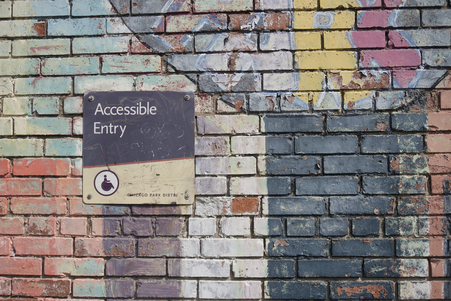
Add descriptive alt text to every image
You're focused on words; images are there to aid your storytelling. They tell a thousand words on their own, or so they say, but they still need a few more words to help tell your story.
Alt text lets you add the words that your pictures are missing. An image on its own won't mean anything to a screen reader, or a search engine. The alt text lets you explain the image so everyone understands why it's there.
Which, for what it's worth, might include sighted readers who don't quite understand the connection between your source material and the image illustrating it. The caption's another chance to explain the picture and its implications and relation to your copy.
You need both: Alt text to clearly describe the image, and a caption to share the meaning of the image.
Write the alt text to describe what the image the way you'd describe an image if you were talking about it. A photo of a tree might include the alt text "A photo of a palm tree, standing in a field, under a blue sky." Then, write the caption to describe why the image is there, something like "What could be more relaxing than sitting under a palm tree?" And don't do it for only photos: Add alt text and descriptive captions to screenshots, GIFs, and videos alike—at least captions, for the latter.
Your site might show up in Google Image searches for palm trees, thanks to the alt text. And your readers will know exactly what and why you're showing, no matter how they're reading your writing.
Write descriptive links.
"Click here to learn more" is the worst possible way to write a link.
You won't even remember what "Click here" links to, a year from now. Your readers don't stand a chance. They deserve more information about what exactly they're in for, before they click.
The best links describe exactly where they'll take you when you click them. The first time you mention a company or product name, link to its homepage. Link the credits after the quote to their original source—and link the whole "said Person Name," not just the word "said." Link to a full phrase, like notes apps are where ideas go to die, using the title or a direct quote when linking to another site on your site. And for CTAs (call to actions) like newsletter or app signup links, link the full phrase like "join our newsletter" or "signup for Reproof" instead of linking only the word "join" or "signup."
It's better for readers, who'll know what they're clicking on. It's better for screen reader apps, which will announce the linked text as yet another way to skim an article audibly (and here's where single-word links fail the most). And, it's better for Google search, where the entire search algorithm is built around links and their meaning.
Add aria-label when you can't add alt text or descriptive links
Some things defy simple description. You can't add alt text to an emoji or a YouTube video embed. But you can add an aria-label to content that computers might need a bit of help figuring out how to read out loud.
Aria labels tell screen readers what an element on your site does. Your dev team might have already added aria labels to your site's menus and signup buttons. You can extend the trick to content you want to explain further in your blog posts.
Say you want to add a tongue-sticking-out emoji (😛) to your blog post to indicate sarcasm. Some screen readers will read out the emoji's official name, "face with stuck out tongue." Others will skip over the emoji, or, perhaps worse, read out its unicode name U+1F61B. Instead, add your emoji in a span, and include an aria-label tag like this:
<span aria-label="just kidding">😛</span>
Even better, you could also include a title tag, like this: title="just kidding". That way, everyone will understand what you mean, with a screen reader or by hovering over the emoji.
Use plain language.
Plain language—words your audience can understand the first time they read or hear it—is the newest buzzword in what we should have been doing all along. Write simply. "Don't use a five-dollar word when a fifty-cent word will do," Mark Twain is said to have quipped in praise of simpler language.
Simple depends on your audience. You should know, generally, what your average readers should and shouldn't know. For the sake of the beginners, define things early on—perhaps in simpler, more introductory posts you can link to in subsequent, more advanced content. Use a trick from The Economist, where companies, no matter how well-known, are described the first time they're mentioned in an article (Coca-cola? "The fizzy-drinks maker." Foxconn? "A Taiwanese manufacturer." And so on.). They're tongue-in-cheek, at times ("TikTok, a time sink."), a self-aware joke at the seeming redundancy with well-known companies. But no one knows everything; a few extra words to describe and define make your writing more accessible to everyone.
And to Google. Ever noticed a definition block at the top of a search result that didn't come from a dictionary? Often those come from in-copy definitions like these, which Google picks up as a more friendly way to explain a concept. Define words for your readers, and Google might take a liking to your definitions, too.
Then, it's back to the standard editing tricks. Read your writing out loud to see if it flows, and where to simplify. Cut out extraneous words and unnecessary phrases. Get others to proofread your writing and ask them for places you can simplify things. That extra bit of defining and editing, along with your well-structured prose and labeled images, will go a long way in helping all of your readers navigate your ideas.
Check your site's accessibility
Everything else in this list you'll need to check every time you write. But sometimes are once and done, thankfully, or at least something you can just check every so often.
You know the core SEO things you should have on your site, the page title, site language, description, and more? Those things that help search engines play double-duty for accessibility. The title's going to be read out loud by screen readers; make sure it makes sense, for anyone who comes across it. The site language is how Chrome will decide if it should offer to translate your site for people who use a different language by default. And so on. Audit your site to make sure those things and core accessibility and SEO-focused features are working (check this simplified guide to the Web Content Accessibility Guidelines for the core things to check).
Then, try using your site in a screen reader. Check this guide to screen readers for a quick overview if you've never used one before, then try running through your blog using a screen reader. Notice anything that's broken, that would keep someone from successfully browsing your site through sound? Get that fixed, to make everything you publish better for everyone.
Then it's back to writing—this time, with a focus on making your writing great for everyone, every time.
Image Credit: Header photo by Daniel Ali via Unsplash.